

There was an undeniable “golden age” of television programs that spanned three decades  from the 1960’s through the 1980’s that just seems so different from the early television fare that came before it, and the more modern small screen shows that have come since. Remember when TV shows had real theme songs, and a real opening montage? Who can forget laughing every time Dick Van Dyke tripped over the ottoman, smiling when Mary Tyler Moore tossed her beret into the air, or holding our ears in agony while Jean Stapleton tried to sing?

Edith! Will you stifle yourself?
Networks have blown up the traditional beginnings of today’s prime time shows because they want one show to segue straight into the other, giving the viewer less of a chance to flip over to something else before they become entrapped in the storyline of the next program. But what’s really taken the hit is what comes at the end of the show. Rolling the credits, as we once knew it, practically doesn’t exist anymore. Now programming executives redo the original credits from a show, squash them into a corner of the screen, and roll them so fast that you can’t even find out who the damn guest star was, let alone who was manning the best boy grip.

A real, honest-to-God best boy grip, in case you ever wondered what one looked like…
One of the many great things about the older shows from the golden age wasn’t just the show’s unique credit roll, it was those little production company idents that would appear at the very end. Sure, they’re still around nowadays, but they usually play before the faux-credits roll, which takes away a lot of their appeal. And besides, they’re just not as good as the old production company logos. Back in the day, every production company worth their salt got together with someone who was on the cutting edge of cheesy TV animation at the time to craft their 5 second business card they tacked on to the end of all of their shows. And that wasn’t even good enough, because they were also scouting out terrible orchestras and out of work prog rockers to come up with some of the most annoying short jingles in history.

This has been a Filmways Presentation, Dahlink!
Take shitty animation, horrifically bad music, horrendous seventies fonts, and throw in the element of surprise these little masterpieces of “LOOK AT ME!” theater could often render if you didn’t know they were coming, and you get a very weird phenomenon. Go on YouTube and start looking up videos of some of the classic production company identifiers out there, and you’ll see most of the uploaders and commenters have the same strange adjective they use to describe them…. scary!
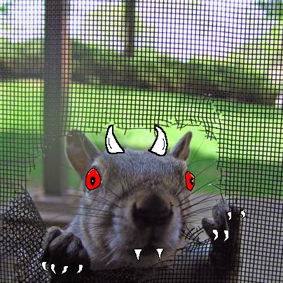
BWAHAHAHA!!!! I’ve come to eat your chileh!!!
I’m not so sure scary is the right word to describe most of these short bits of nostalgia. But creepy? Fuck yeah. Especially if it was at the end of a rerun you were watching late at night and you were already half asleep. Just watch this compilation and see for yourself that these were creep overkill…
It’s not hard to see how a small child might be frightened by some of these, and even an adult can still get goosebumps watching that Viacom V of destruction headed our way like a giant tornado while the overly loud synthesized music plays to a crescendo. What in the world were the creators of these old animated logos taking that made them think this was the best way to promote their studio?

Ehhh, nevermind.
But even if some of them did come off like they should be put at the end of a horror film, The Nest still gets a warm fuzzy feeling every time we get a chance to flashback to a day and age when we actually used to watch TV because it was worth watching. Thanks for all of the chills, thrills, bad synth riffs, and strangely shaped letters moving all over the freaking place. And to wrap up this piece, I’d like to show off some of the artwork I was inspired to draw while I was doing the research for this week’s Flashback Friday… where I added my own unique characters to some of these classic idents. Enjoy!
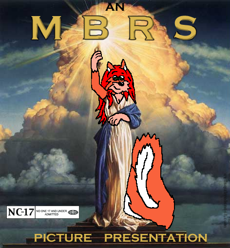
I don’t think this is gonna be no Three Stooges flick…

Squirrels make early 80’s PBS seem so much less creepy…

Meow!

Sit, Skanki, Sit! Good dog!
And because you knew I couldn’t possibly leave him out…..

Benny Hill, Danger Mouse, and Rainbow Donkey! Cheerio!


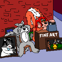



I was gonna say something witty…Meathead? Um…hey guys, pass that hookah….Oh wait. Those were the days.
Squirrels were squirrels and men were men….
But Archie!!!
Say it with me….. Awwwwwwwwwwchie!!!
Awwwwwchie!!!!!
Perfect! Now stifle yourself, Edith! 😉
😉
The giant DIC outside the bedroom window is rather … wrong. 😉
“Mommy! Mommy! There’s a giant DIC outside my window!” And it’s a flying DIC! Yeah, that would most definitely be wrong…. 😉
I think that may be the most disturbing one of them all. The rest, except Ubu (SIT), all make me think they were tripping when they designed them, or at the least in the midst of a flashback 😉
I remember most of those. And yeah, many of them look like what you’d expect to see at the tail end of a Big Brother telecast from 1984.
The most famous was probably UBU. I would sometimes try to get my dog to sit by telling him, “Sit, Ubu, sit. Good dog.” Sadly, he never woofed in response.
Ubu stands out from them all for having no animation and no music, and it does seem to be the best remembered TV production logo. I’m not sure what made Ubu such a good dog since he never did listen to his master’s command…
I assume that he did sit. Why would you think otherwise?
It’s the cynic in me, I guess. It’s pretty bad when I can’t even trust Ubu….
Yes! I have always wondered what a ‘best grip boy” looked like! Loved the Artwork!
Thanks! And I’m glad I cleared up the mystery behind the silver screen!